Origin Plotting
©️ Copyright 2025 @ Liu Theory Lab
Author:
Ziyue Lin 📨
Date:2025-10-20
Lisence:This document is licensed under Attribution-NonCommercial-ShareAlike 4.0 International (CC BY-NC-SA 4.0) license.
I. VASP Plotting
1. Band Structure
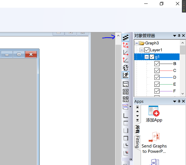
Export bnd.dat to your local computer and drag it into Origin
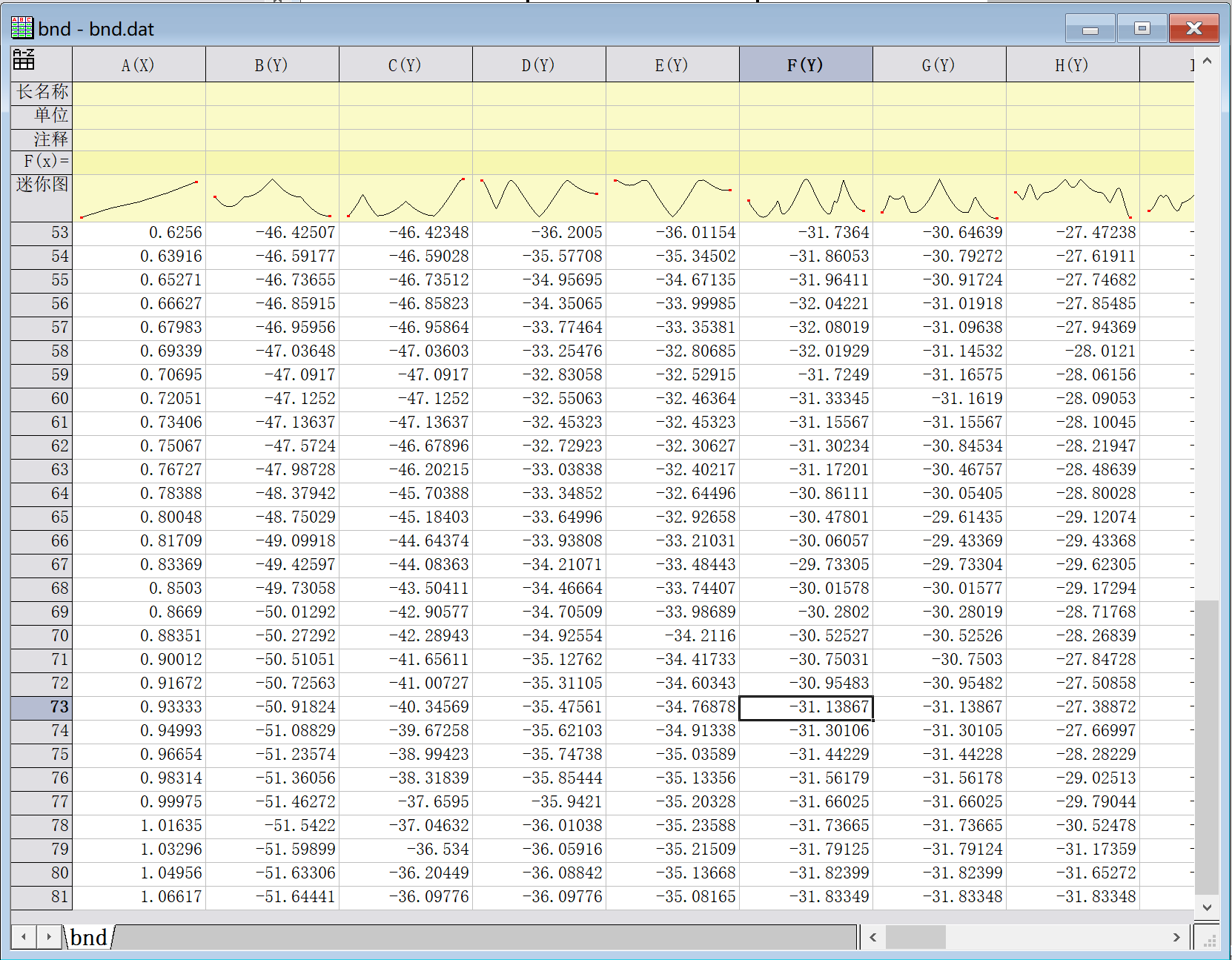
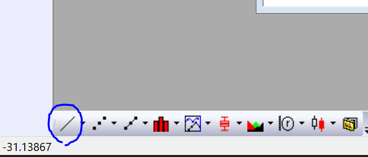
Click on the line plot icon in the lower left corner
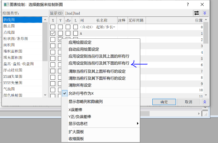
Select Column A as X and columns after B as Y
Right-click and select "Apply settings to current row and all rows below" to select all below, then confirm to plot
After plotting, double-click on the axis to start modifications
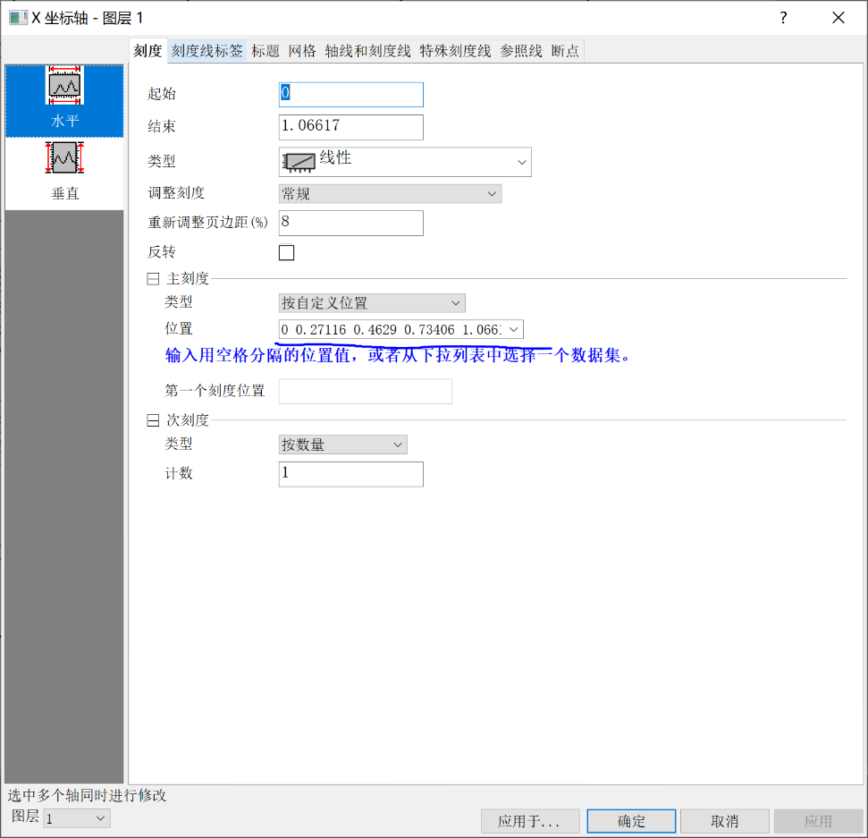
(1) Scale
Set horizontal start to 0 and end to the maximum value of the x-axis;
Set vertical range according to the image range
This range should be consistent with the x-axis range of the subsequent DOS plot
For horizontal major ticks, select "By Custom Positions". These five values correspond to the five high-symmetry points inserted in k-space.
For example, if 5 high-symmetry points are inserted in the syml file, with 20 k-points inserted in each of the four intervals,
then input the values from rows 1, 21, 41, 61, 81 of the first column into the [Position] box - as shown above
Vertical ticks are optional, as long as they look good
(2) Tick Labels
Set the bottom axis type to "Tick-indexed Dataset"
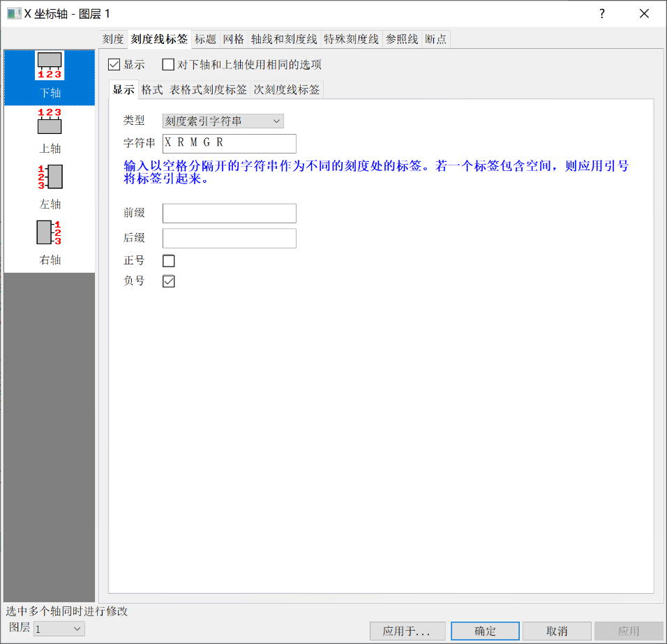
Input high-symmetry points in order
X R M G R
Left axis remains unchanged
Format: Font color is optional
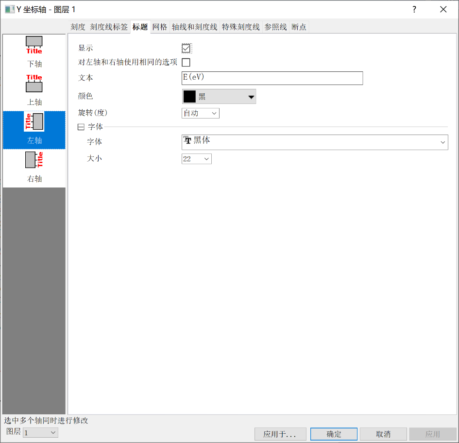
(3) Title
Change left axis text to E(eV)
(4) Axes and Ticks
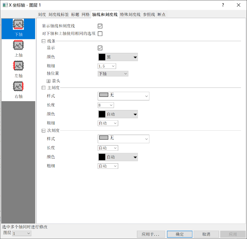
Display axis lines and ticks for bottom, right, and top axes, but set both major and minor tick styles to "None"
Keep ticks on the left axis
(5) Reference Lines
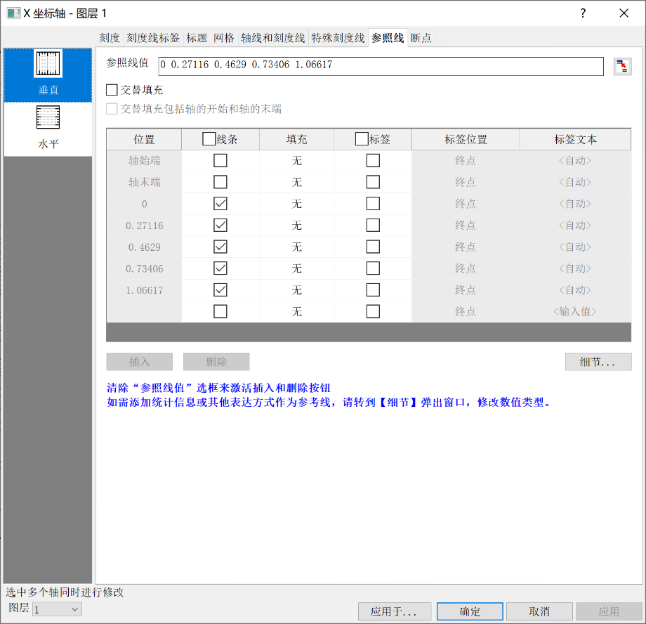
The input method for reference line values is the same as for custom tick positions
After input, click Insert, then click Details
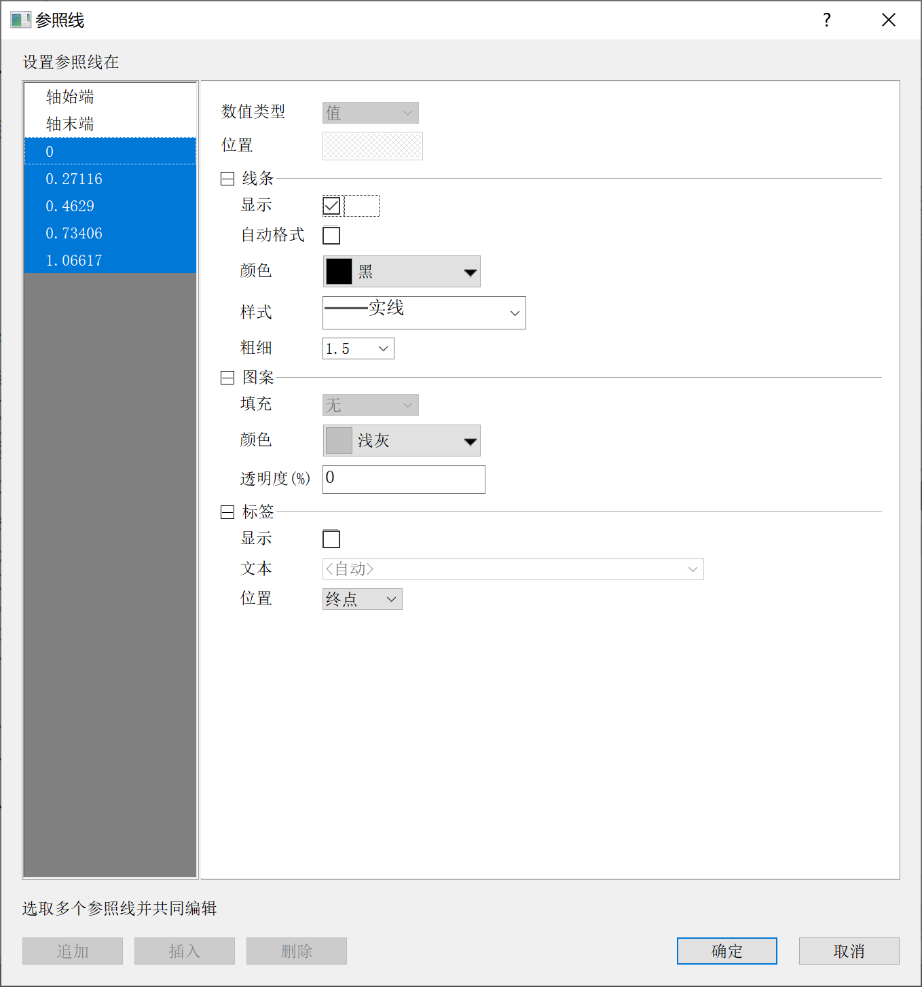
Shift-select the inserted lines, uncheck Auto Format, set style to solid line, color to black, and thickness to 1.5
Confirm
Finally, click OK to apply
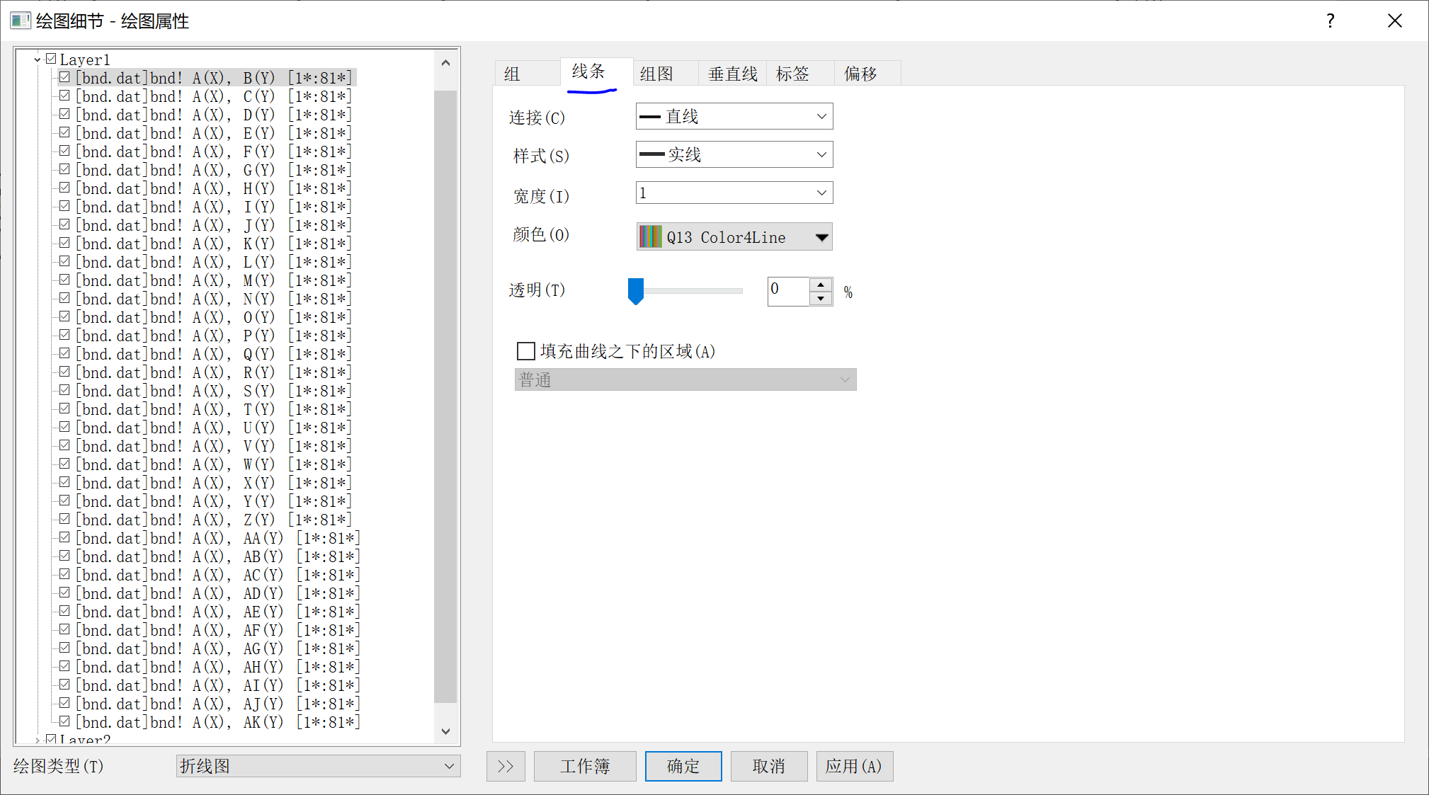
(6) Adjust Plot Lines
First, click the anti-aliasing icon on the right to smooth the lines
Then double-click on the lines in the plot, select the Line tab, set width to 1, and confirm
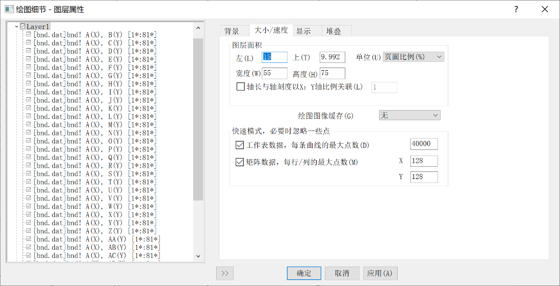
(7) Adjust Size
Double-click on the blank area in the plot, select the Size/Speed tab, and you can adjust properties like left, top, width, and height
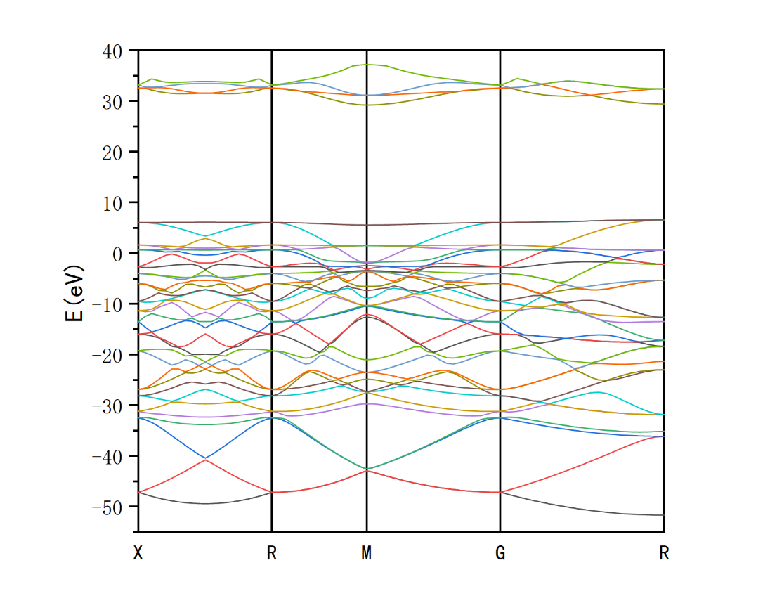
The final band structure plot is shown in the left figure
2. Density of States
(1) DOS Plot
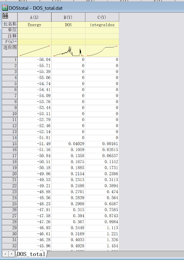
Import DOS_total.dat
We only use columns A and B to plot the total density of states
Plot with column A as x-axis and column B as y-axis
If you want to integrate with the band structure plot after plotting
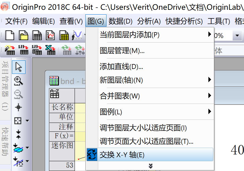
First click to exchange X-Y axes
Further adjustments are the same as for the band structure plot
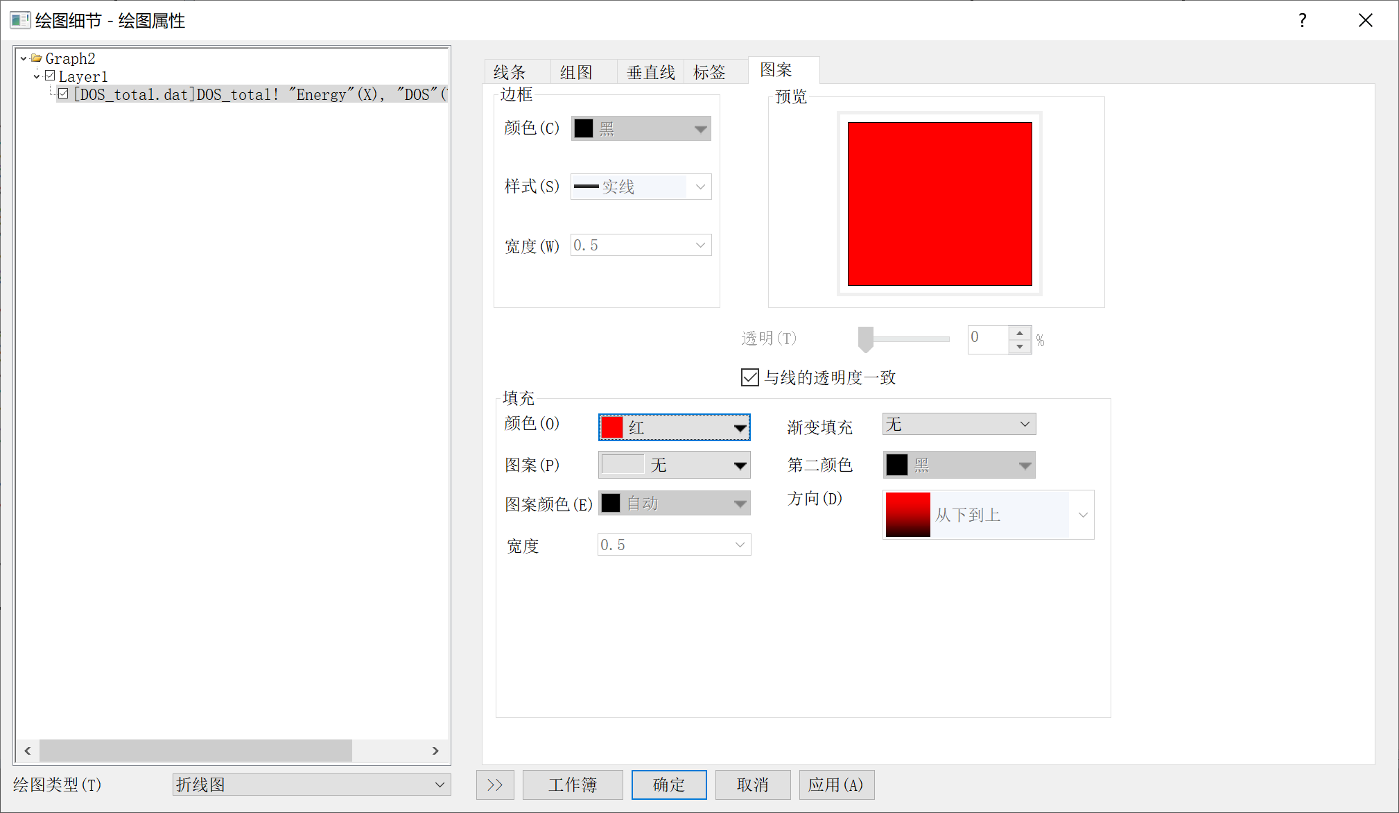
If fill effect is needed, select the plot line and check "Fill Area Under Curve"
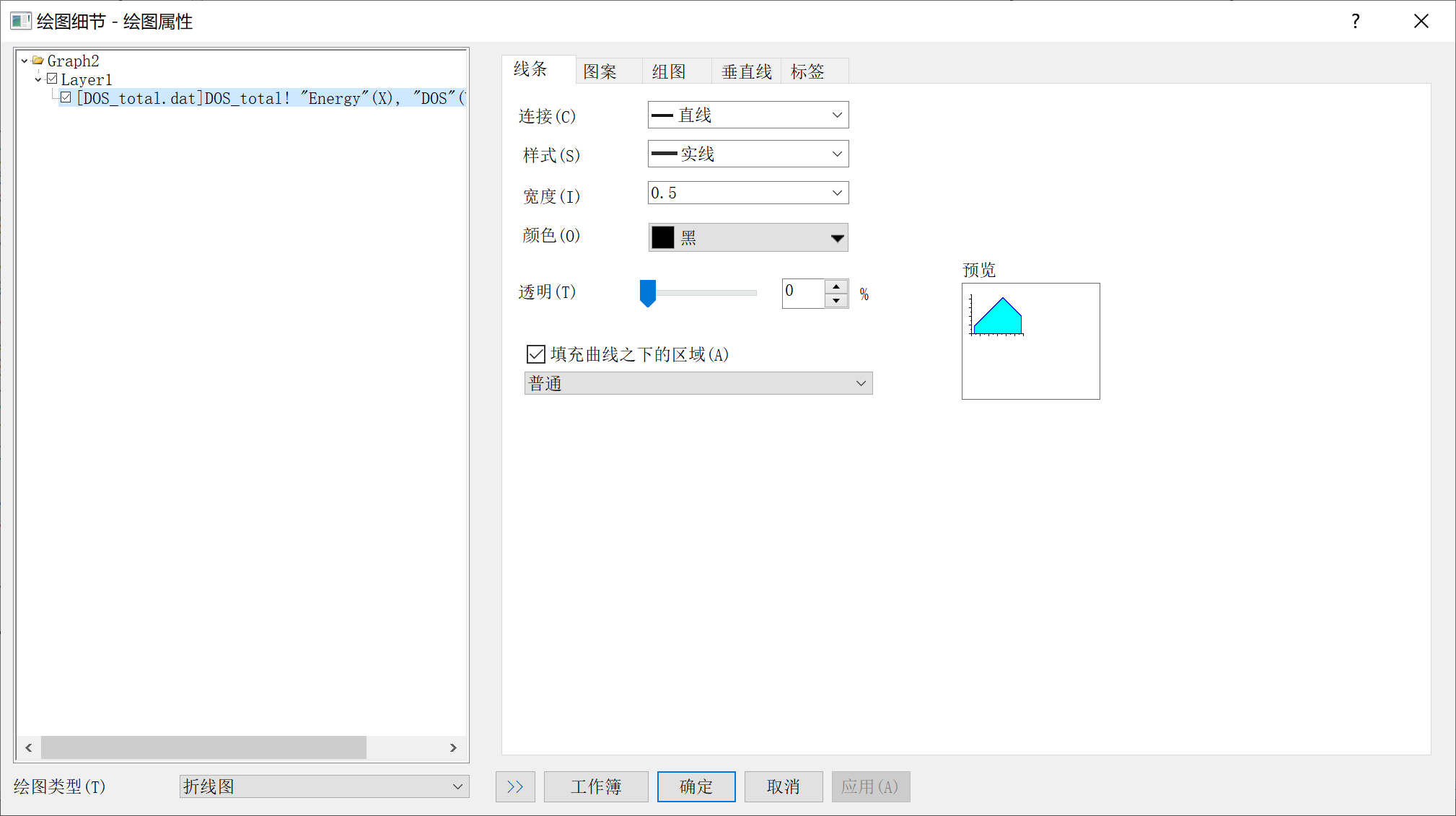
Then switch to the Pattern tab
Select appropriate color or pattern
(2) Band Structure-DOS Plot
Now we merge the graphs
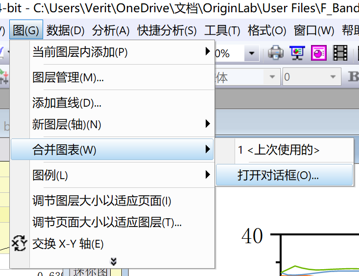
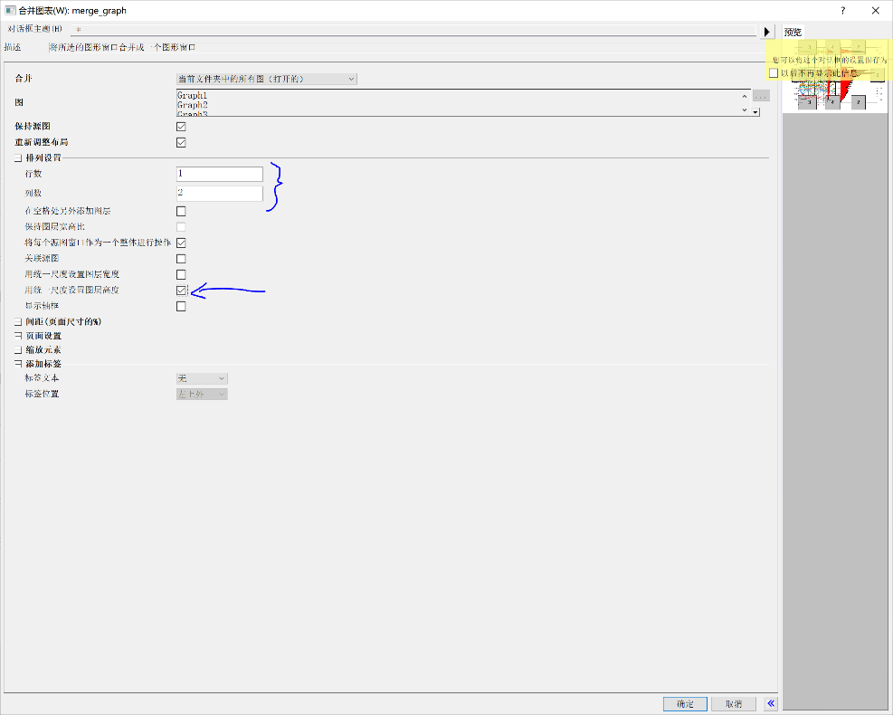
Select Graph - Merge Graphs - Open Dialog
In arrangement settings, set rows to 1, columns to 2
And check "Use uniform scale to set layer height"
Finally, merge the two graphs by adjusting graph size or using left/right arrow keys
3. Phonon Spectrum with phonopy
Drag the generated band.dat into Origin
Other steps are exactly the same as for band structure plots, except that you need to find the high-symmetry point path yourself
Open the band.yml file in the folder (open directly with vi editor or notepad in xftp)
For example, to find the second high-symmetry point 0.5000000, 0.5000000, 0.5000000 (note the format)
In CentOS:
In Notepad:
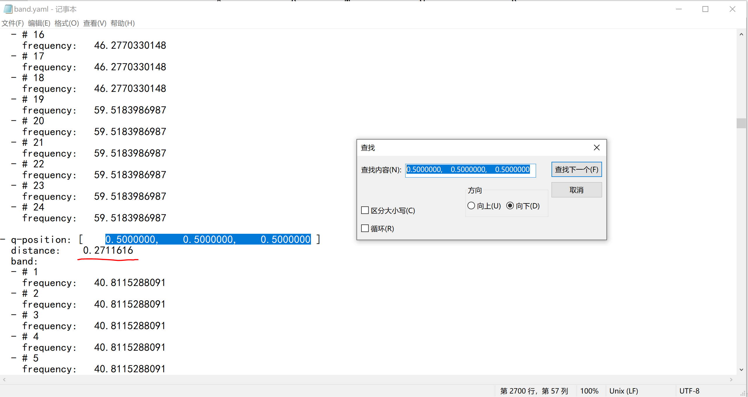
By searching for high-symmetry points, obtain the distance value below, which is the x-coordinate of the required high-symmetry point
The subsequent steps are the same as for band structure plots
4. Phonon DOS with phonopy
Drag total_dos.dat in, the procedure and merging steps are the same as for band structure-DOS plots
II. CASTEP Plotting
1. Band Structure
Enter command:
Export to local using Xftp. Then drag *.txt into Origin to directly obtain plotting data
Note when plotting: check the .txt file, columns 2, 3, 4 are K-points and should NOT be used for plotting. Start plotting from column E (column E as X-axis, subsequent columns as Y-axis)
Regarding determination of high-symmetry point positions
First find the K-point coordinates (columns B, C, D) corresponding to the high-symmetry points. The value in column E of this row is the x-coordinate of the high-symmetry point on the band structure plot's X-axis.
How to subtract Fermi energy: Search for "fermi" in the .castep file, the obtained energy is the Fermi energy.
Other steps are the same as before
2. DOS Plot - No Difference
3. PDOS Plot - First Column as X-axis, Others as Y-axis
4. Phonon Spectrum
Then plot the same as above for band structure, also note that columns 2, 3, 4 are K-points and should NOT be used for plotting
III. Quantum Espresso Plotting
1. Phonon Spectrum
Plot using the output F.freq.gp. Note that the phonon spectrum output by QE is uniform, and the high-symmetry point positions depend on the number of k-points you initially inserted between high-symmetry points.
For example, with five high-symmetry points and 20 k-points inserted between each interval, when plotting, rows 1, 21, 41, 61, 81 correspond to the first column values in F.freq.gp, which are the X-axis coordinates of the high-symmetry points.
2. Phonon DOS
Plot using phdos.dat, no special instructions
IV. Airss, run.pl for Binary Convex Hull/Enthalpy Difference Plot
Two main points for plotting: connecting lines and adding annotations (mainly for those who don't want to use PS or find it troublesome)
Determining Enthalpy Difference:
Both ends can be pure elements or compounds
If both ends are set as pure elements, the vertical coordinate uses the value on the right of the fourth column listed by the ca -m command, which is the automatically calculated average enthalpy per atom. If there are compounds at both ends (this method can also be used if both ends are pure elements), taking RbF on the left and pure element F on the right as an example
For RbFx
Total enthalpy difference:
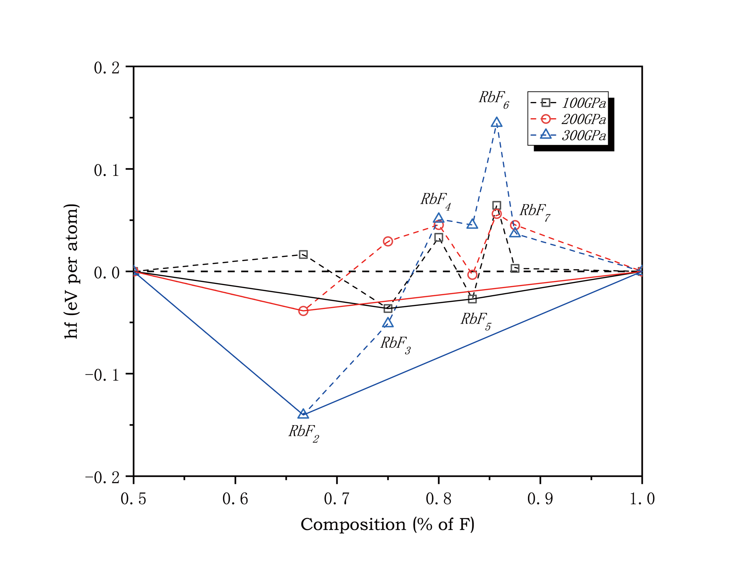
E in the formula is the value to the left of the fourth column listed by ca -m
Average atomic enthalpy difference: Total enthalpy difference/(1+x)
Setting Column Values
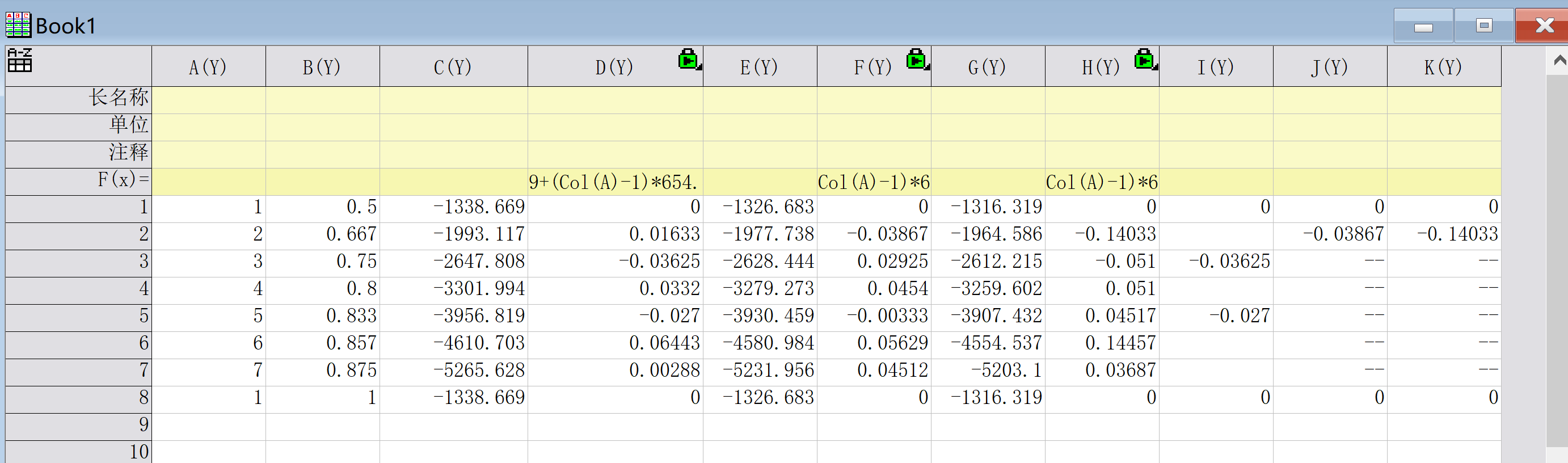
Taking Rb-F compounds as an example,
First, in the first column, set the number of F in the compound RbFx. If both elements vary, two columns are needed. If F is not among them, set it to 1.
The second column sets the proportion of F in the compound.
The third column C(Y) is set to the enthalpy value in the left of the fourth column listed by ca -m at a certain pressure point.
D(Y) needs to set column values. Right-click on D(Y) - Set Column Values, then input in the following box:
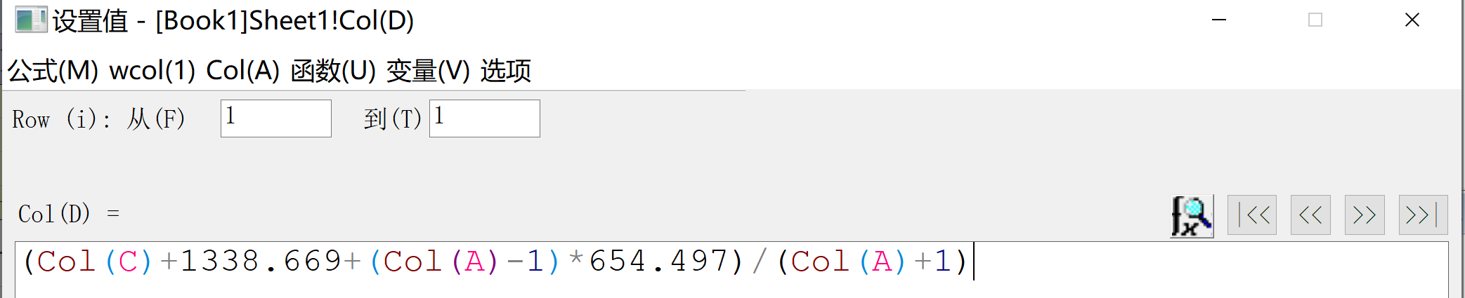
Input corresponding values according to the enthalpy difference formula
Columns E to H are calculations for other pressure points
Columns I to K are convex hull lines. Those showing a plus sign or 0.000 in the sixth column listed by ca -m indicate they fall on the convex hull plot
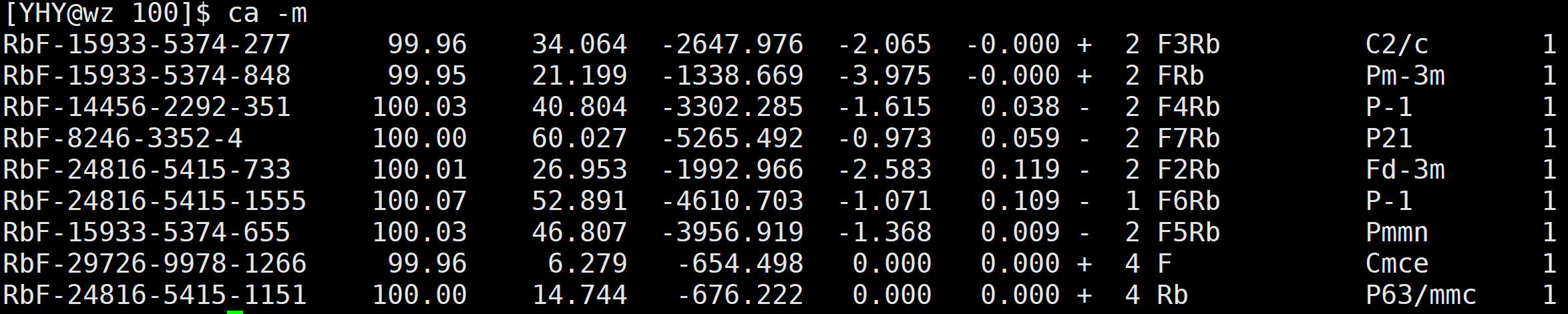
Copy the enthalpy values of these structures from the enthalpy column to the corresponding columns I to K
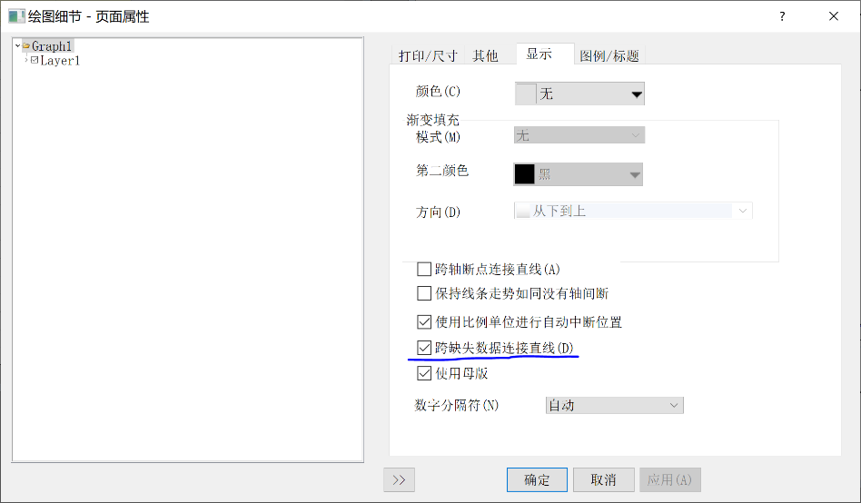
Then connect lines to make the convex hull. Open Format - Page Properties - Display to open the dialog below, and select the option to connect straight lines across missing data to connect the lines
You can then change the line style, thickness, color, etc. by double-clicking on the straight lines in the plot
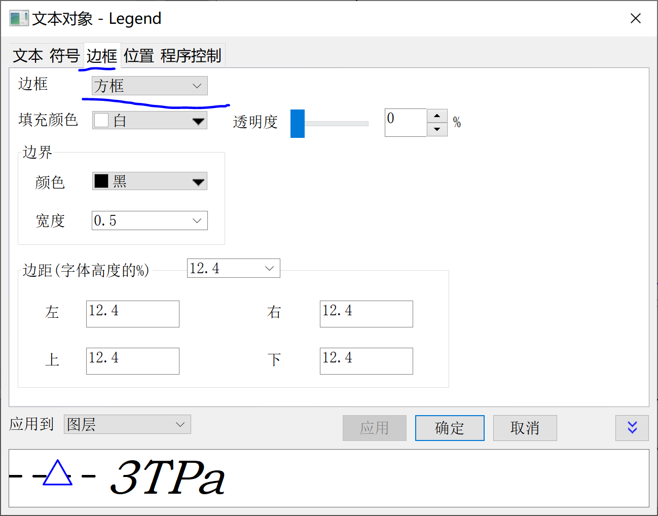
Then for annotations, the simplest way is to copy the legend in the upper right corner, then select no border and change its content, or click Insert Text on the left
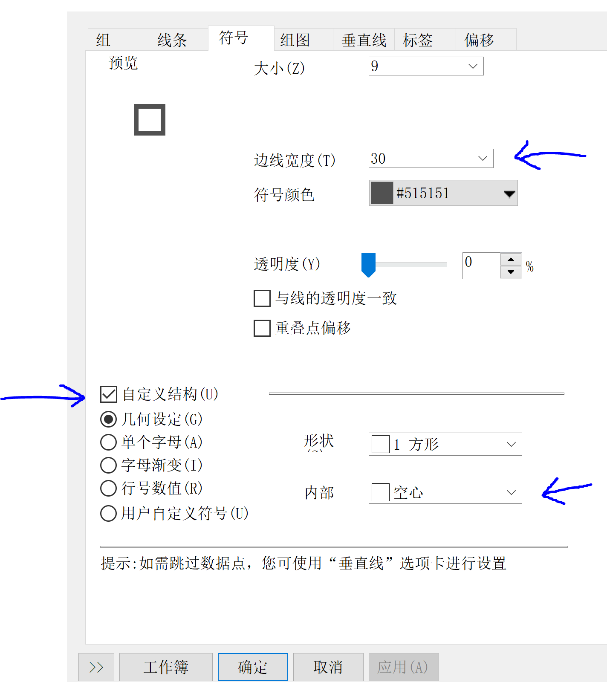
Final image editing: double-click on lines, check Group - Edit Mode - Independent
Symbol - Set size to 0 for columns I to K
Set lines I to K to solid, others to dashed, all bold
Other notes: For output images placed in AI, if you want to save as eps format, remember to save the AI file itself as eps format, not just save the image.
V. Convex Hull and Phase Diagrams
See the uploaded convex.opju and phase-diag.opgu
Notes:
Phase diagrams use floating bar chart plotting. Ctrl+left click can specify the color of a specific floating bar segment
About segmented scale creation: Double-click on the scale to see how to select points